- About MTN
Would you like to stay up to date on the latest MTN world news? Products, graffiti, murals, festivals, art and much more.
Return We Were There - III: Behind the design of Montana Colors
AN AESTHETIC REVOLUTION
Founding a brand of graffiti spray paint from scratch meant numerous different steps to take. One of the most significant moments to look back on, almost 27 years later, is the origin of the graphic design that would accompany a brand new product aimed at the graffiti scene.
Paint that had been produced in the local market up to that time didn’t look particularly impressive, since no special attention was paid to the aesthetics of aerosols. Traditionally spray paint came in white cans with words and icons related to painting, DIY or vehicles; basically plain and generic packaging. So something different had to be done, in keeping with the philosophy of what was being created by the young team at Montana Colors. Simply choosing to use a black background to begin made the Montana Colors design stand out from the rest.

THE ORIGIN OF THE FAMOUS “BALL” LOGO
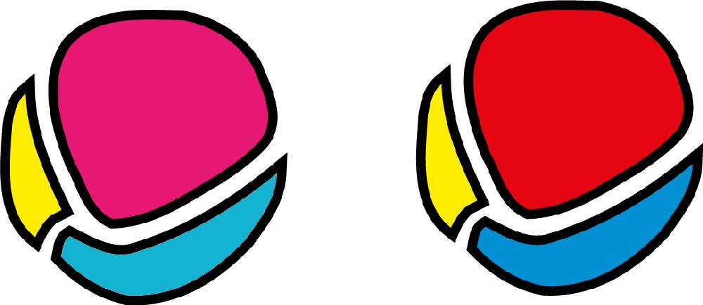
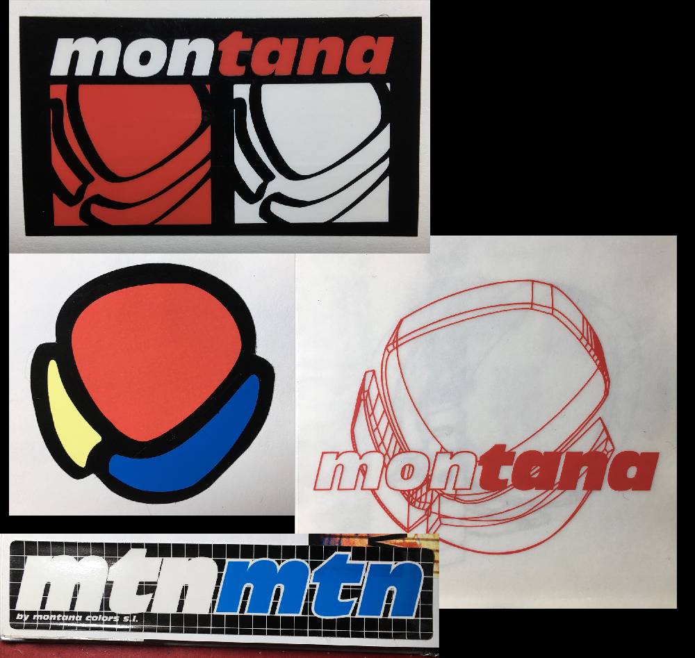
Jordi Rubio started to research designs of related products but often found inspiration in the most unexpected of places. He came across a bottle of contact lens solution that with a grid pattern. “He showed me the bottle and told me that he liked the grid, that it was a good starting point for the first design,” explains Mar Roig, who began as a graphic designer at Montana Colors. The same product featured the brand name printed vertically, a trend also seen on some soda cans. The ball, which became the brand's first recognizable logo, was also created by Mar. “I invented an icon that encompassed 3 ideas: the world, color and paint,” she explains. The now famous "RAL range", explained in the previous chapter, had become popular with graffiti writers during the previous year, and had made some colors “fashionable”. Erika pink and the Turquesa blue were big sellers, so they were chosen to be part of the logo.

RAPID SUCCESS CEMENTED PROVISIONAL IDEAS AS FINAL DESIGNS
There wasn’t a market study or a brand image strategy behind the creation process. Everything was decided on the fly and as a result, some design looked provisional. Soon after, things started moving faster than anyone could have imagined and the graphic elements were consolidated, transforming into aesthetics that were used to produce merch like clothing and stickers. Even so, the colors of the ball logo continued to evolve over the years, getting closer to the CMYK register, a standard in the world of graphic printing.
On June 25, 1994, during the celebration of the first festival that brought together writers from various European countries in Barcelona, the first sample cans were presented. The participants were amazed at the appearance of 200 units of black Montana Colors Classic - as they will testify in chapter four of We Were There.

 ShareNovember 18, 2020
